Friday, May 13, 2011

Finally...


Finally, the final product is done.
Here is the some print screen that I would like to share besides the angle that require to be submit
for the project.
This is some angle that I like because it show alot of texture and details especially those PC and the effect of it.
Overall, the process is quite enjoy as I like to play around with Maya, so it won't be a big deal for me. However, I learn few new stuff like MudBox for texturing,glow effect and etc in this assignment.
Besides, through this course and assignment, I have learn that when we create something, especially is for using purpose, we can create as creative as possible. However, creative is not only the part we have to think of, rational or common sense also playing important roll especially when creating an exhibition like this. The size of everything have to be logic and realistic.
So, Environmental Design teach me alot theories that I never notice with and it make me can think more wisely and in the same time creatively.

Monday, May 2, 2011

Some Examples of Exhibition


Here is some examples of exhibition that I found on the internet and feel creative and nice.
From all the examples, the conclusion that I found is that exhibition can be as complicated as possible but it can also be simple as it is just a plain of rectangle shape.
Besides, as long as the design of the exhibition is related and accepted for the exhibition, the exhibition will be a successful. It is not necessarily that an exhibition have to be like what we use to see and it also no need to make it too complicated as it will only make the visitor feel hard when going in it.
So, Different exhibition can be use in different kinds of situation as long it can bring out the messages.


Saturday, April 30, 2011

Glow Effect On Maya


Maybe someone already know how to make it, but it is something new and I just found out how to make it.
Actually it is very easy with just a few simple step.

1.create the model you want and put texture on it.
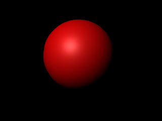
2.after apply the texture on the model, you will get the model like what I show in the 2nd picture, a normal model.
3.here some simple trick you can do, go to the material attributes and search SPECIAL EFFECT.
4.in the special effect, there will be a stuff name glow intensity just try to modify it.
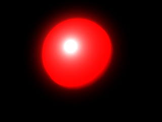
5.render it and see the effect, it will just like the 1st pictures. The glow of the object will base on the density u adjust. The higher, the glower it is.

Enjoy it!

Friday, April 29, 2011

In the progress


I am on the way to finish the exhibition design.
Here is the wire frame that is print screen from it. However, details have not been put in it so does for the texture.
Mr.Zul have give some advice for me about the design exhibition.

1.make the stage for the testing area become lower.
2.make the table for putting the product higher so people can easily reach it.
3.put some logo or banner on the top of the circle of the exhibition and so does the wall beside it.

I will improve the design base on it and make it better.

Friday, April 22, 2011

ACTIVETEAM


http://www.activteam.com/

Here is a link that can be references for some idea to design an exhibition.
In the website, it provides alot of different kinds of design of exhibition with different themes.
Not that only, they will also tell you the reason why they design the booth like that and why they choose the theme for it. They will tell their thoughts and their ideas.
So, it is worth for you to take look on it and maybe you will find some good ideas and design.

Spaceship Design


Yes, my exhibition design is about spaceship. So, I like to share some information or pictures of some examples of spaceship.
Spaceship have different kinds and most of it is looks modern cause spaceship is a high technology stuff. Actually spaceship can be exist in any kind of shape or design because there is no certain theory or law that what should a spaceship looks like. However, I use the shape just like an UFO so people can easily recognize it and know it will about alien.
So take a look on it and find your own spaceship design.


Saturday, April 16, 2011

Project 2 Phase 1


Here is the concept board and the exhibition profile for the exhibition design that I will be create soon.
The exhibition profile is talk about what will be provide in my exhibition.

1.Information counter & Cashier.
2.Demonstration and Talk.
3.Resting area.
4.Display area.
5.Entertainment area.

As for the concept board, The theme I will be using will be just similar to the theme of the alienware itself. It mostly using the dark, especially black metallic as the main color. Beside, the light glow effect that will be using also was shown in the concept board.


Friday, April 15, 2011

Model Making


Maybe it looks not so related to the assignment, but I would like to share the work of my model making. For me, model making is just like environmental design, it is talk about the model we design how it relate to it's environment and how they connect to each other.
The model making I made is a fort during the ancient China period. The idea is that the fort is not only defend against the enemy from the land but it also prevent enemy can easily attack them using the sea. So, an defensive wall is build and their ship can be save inside the area of the wall.
They also can attack the enemy from the wall just when their enemy still in a far range.

Friday, April 8, 2011

Confirm Design


Here is the final sketch for the Project 2 exhibition.
The concept I use for this design is Spaceship. First, the center of the exhibition is like the main control center for the spaceship. Testing area and display area is apply on that area.
Next, the four corner of it is become two different part. The front part is the cashier and information center. For the back, it is a rest area for people and in there, it will providing some video about the product to show people through LCD.
And for the back, There will be a big screen, just like the big window for the spaceship to let them see what is in their front. The big screen actually is a small stage that will providing demo and talk. There will be also people will giving talk on that stage.

Looking For Internship


Now, people are rushing time to get their internship.
We were been asked to create and creative resume so that we can attract the company attention so we will have bigger chance to get the place.
However, it is not easy to create and creative but show our own personality resume.
I got some nice example from this website and hope it will help some.

I had created a resume for myself even though it is simple but it reflect my personality. I like simple design with some dark color as background. Simple design, however it does not mean that simple design is easy and lack of creative or looks bad. Simple design nowadays is popular and for me straight to the point and simple to understand is the most important key for nowadays society.


Saturday, April 2, 2011

Proceed To Project 2


In Project 2, we were asked to create an exhibition for a product that we choose.
The product I choose is gaming PC, Alienware.
Here is some research for the brand.
The logo of the brand is an alien. It represent technology and science fiction. They sending the message that their product is high technology as alien stuff or as high as the stuff that in science fiction movies.
The color theme for it is usually black with another colors.

Standee For Environmental Design


Here is the Final Artwork for standee in project 1.
The location I choose is at Alamanda Shopping Mall. The theme I using is bout modern + nature.
So the shape of flower + the texture of modern = the design of this.


Friday, March 25, 2011

Rendering Skill

Here is a link that can be try if you want to render some stuff looks very real.
But prepare to wait because it taking alot of time to finish render 1 frame.
However, it worth when you see the result. ^^

Thursday, March 24, 2011

Model Making

Here is a video that show the model making of a building. Although now we are not making an building, however the way it work I see is similar and from it maybe we can learn something or know how to make our model to become better.

copy and paste it : http://www.youtube.com/watch?v=uN85_Y-5P3g

Thursday, March 17, 2011

Creative Directory Sign


For environmental design,we have to build a directory sign. I have choose to create a directory sign for Putrajaya Alamanda Mall.

For references, I have search some I think it is quite different and creative sign compare to those that we often see.

For the first, I feel it is quite creative because of the idea. Usually, people create a sign that have a platform, however this sign,it is different that it is like a trees that have branch to show people where the place is. Besides, it design is combination of natural and modern, just suit the theme I want to create for my directory sign.

Here is a link that show some design of directory sign.
copy and paste it : http://www.youtube.com/watch?v=rpE-Us6NNIg

Monday, March 14, 2011

Navigational Sign


Actually what is navigational sign? Navigation means to control or show someone the direction. So, navigational sign means that something that to show someone the direction so that they can control someone movement from a place to another place.

Nowadays, navigational sign can be seen anywhere with different kinds of design n function. It is playing an important role to help someone to reach their destiny. Besides, it also function as messenger to send message to peoples.

From above, there are 5 photos that taken at Jusco, Seri Kembangan. There can categorize as 3 different types of navigational sign. 1st, the whole map of the mall, it tell peoples the information or things that they can find in the mall n their excatly place.People can easily find the shop they want thru it. Second, the directory sign that using symbol to direct people where exactly the thing is,for example, atm machine, toilet and etc. For the third, it is a sign that tell people what section is this. From the photos, we can see that it is a audio visual section,it means people can find stuff such as speaker in this section.

So, navigational sign is playing an important role in our life. It helps alot and make our life a lot easy. However, not all the navigational sign is helpful, there are some that very blur and make confuse to people. So, when we trust a navigational sign, try to understand and make the right choice so we wont lost ourselves.